Understanding How Colour Choices Affect Your Users & Brand Perception
In the digital world, colour is not simply an aesthetic choice; it’s a crucial communication tool. The way we perceive colours in web design can significantly affect our emotions, decisions, and understanding of a brand. The world of colour psychology in web design is a fascinating and insightful one, so read on and learn as we here at Social Media Marketing unravel how colour choices can impact user behaviour and shape brand perception.
Diving Deeper into Colour Psychology
Colour psychology extends beyond aesthetic appeal and into the subconscious effects they have on human emotions and behaviours. Historically, colours have held significant symbolic meanings in various cultures, influencing art, architecture, and rituals. With the advent of modern psychology, the study of colour’s impact on human psychology has gained a scientific footing. This exploration is particularly relevant in web design, where colour choices can elicit a wide array of emotional responses.
The colour red, for example, is often associated with energy and urgency, evoking a feeling of excitement or alertness. On the other hand, blue, commonly linked to stability and trust, tends to induce a sense of calm and security. The effective use of colour in web design hinges on understanding these nuanced psychological effects, enabling designers to create experiences that resonate emotionally with users.
The Role of Colour in Branding
Colour is the silent ambassador for brand identity. It conveys messages and values without words. Successful brands use colour strategically to resonate with their audience and reinforce their identity. This is not by chance but a well-thought-out strategy that aligns with what these brands represent. Let’s look at how some renowned brands have strategically used colour to carve their niche in the market.
Facebook’s Trustworthy Blue:
Facebook’s iconic blue logo is more than just an aesthetic choice; it’s deeply rooted in psychological principles. Blue is widely regarded as the colour of trust, reliability, and professionalism, which aligns perfectly with Facebook’s mission of connecting people and fostering relationships. The choice of blue also caters to practical considerations, given that the company’s CEO, Mark Zuckerberg, has a red-green colour blindness, making blue a colour he can see the best. This serendipitous combination of practicality and psychological impact makes Facebook’s use of blue a masterstroke in branding.
Coca-Cola’s Exciting Red:
Coca-Cola’s use of red in its branding is as iconic as the brand itself. The red and white logo is not just visually striking but also evokes feelings of excitement, energy, and nostalgia. The brand’s clever use of colour plays into our positive associations with red, such as joy and boldness, which has helped it create a strong emotional bond with its audience. This connection is so profound that it even influences consumer preference, as evidenced by the Pepsi Paradox, where consumers showed a marked preference for Coca-Cola once they were aware of the brand they were consuming.
The Multicoloured Approach of Google:
Google’s logo, with its playful mix of primary colours (blue, red, green, and yellow), reflects the brand’s vibrant, diverse, and innovative nature. Each colour in the logo has been chosen to represent a specific aspect of their business, with blue symbolising reliability, green for growth, yellow conveying friendliness, and red adding a touch of excitement. This ingenious use of multiple colours captures the essence of Google’s broad appeal and its multifaceted services.
McDonald’s Joyful Yellow:
The yellow arches of McDonald’s evoke feelings of happiness and optimism. This colour choice is particularly effective in creating a warm, welcoming atmosphere that’s associated with a joyful dining experience. Yellow, known for stimulating appetite, plays into McDonald’s branding strategy by appealing to a broad range of customers, thereby enhancing the overall appeal of the brand.
These case studies demonstrate the profound impact of colour in expert branding and marketing. From Facebook’s trust-inducing blue to Coca-Cola’s nostalgic red, it’s clear that colours significantly influence consumer perception and brand identity. As such, the strategic use of colour in branding is not just about aesthetics but also about forging emotional connections and conveying key messages without words.
Emotions Painted in Colour
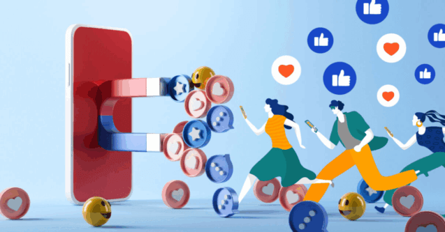
The impact of colours on emotions and user behaviour is substantial and well-documented. For instance, certain colours can strongly influence consumer decisions. About 93% of shoppers focus primarily on visual appearance when considering a purchase. This is significant in the realm of web design, where the right choice of colours can greatly affect user engagement and brand perception.
The psychological associations of different colours vary. For example, blue, preferred by 57% of men and 35% of women, is often associated with trust, calmness, and professionalism, making it a popular choice in corporate and finance-related web designs. Red, signalling excitement and urgency, is frequently used in e-commerce websites to create a sense of urgency in the purchasing process.
Green, symbolising nature and growth, evokes feelings of calmness and hope and is commonly used in websites related to health and wellness. On the other hand, yellow, representing optimism and warmth, is often found in websites related to food and entertainment. Interestingly, about 90% of small and medium-sized business owners believe that their choice of business colours gives them a competitive edge, demonstrating the strategic importance of colour in branding and web design.
Crafting a Harmonious Colour Scheme
Choosing an effective colour scheme for a website is indeed both an art and a science. It requires a deep understanding of the psychological impact of colours, coupled with considerations of the brand’s message and target audience. For instance, luxury brands might opt for a palette of black, gold, and deep purples to evoke sophistication and exclusivity. Children’s educational sites, in contrast, might lean towards bright, primary colours to encourage a sense of fun and learning.
The strategic use of colours can also enhance user experience and encourage specific actions on a website. For example, high-contrast colours improve readability and navigation, while the choice of colour for call-to-action buttons can significantly affect conversion rates. Studies have shown that bright warm colours like red, orange, and yellow can have high conversion rates, while darker colours like black, dark grey, or brown might have lower rates.
A key decision here is whether to opt for professional help or not. For instance, at Social Media Marketing, the team has years of experience in implementing colour-based marketing that ensures it resonates with its intended audience, as well as the multitude of other factors to consider with web design. It’s here that it is incredibly important to ensure a professional design, as a good website goes well beyond its colour scheme, yet it must still greatly consider it, as well as the hundreds of other factors.
User Experience: A Rainbow of Interactions
The strategic use of colour can also significantly enhance user experience. For instance, a well-contrasted colour scheme improves readability and navigability, making the website more user-friendly. Colours can also guide users’ attention to important elements such as call-to-action buttons, forms, or special offers. These buttons, when coloured appropriately (like a bright and inviting green or orange), can significantly increase click-through rates.
However, web design must be inclusive, catering to all users, including those with visual impairments. This is where the concept of colour accessibility comes into play and is again an aspect that professional agencies like Social Media Marketing consider. Ensuring adequate contrast and readability for users with colour blindness or other visual challenges is not just a design preference but a necessity in the modern world. Techniques like using texture or patterns alongside colour can further enhance accessibility.
Navigating Colour Choices with Digital Tools
In the world of web design, selecting the right colour scheme is crucial, and fortunately, there are several digital tools available to assist in this process. Each tool offers unique features but also comes with its own set of limitations.
1. Adobe Color:
Benefits: Adobe Color is renowned for its integration with other Adobe Suite products, making it a go-to for designers already using Adobe software. It provides robust features for creating colour schemes and allows for the exploration of trends and themes.
Drawbacks: It can be less intuitive for beginners and is more suited for those with experience in design software.
2. Coolors:
Benefits: Coolors is user-friendly and great for quickly generating colour palettes. It offers an easy-to-use interface that’s ideal for beginners.
Drawbacks: The tool has limited advanced features, which might not satisfy the needs of more experienced designers looking for in-depth customisation.
3. Color Hunt:
Benefits: Color Hunt offers a large, user-generated collection of colour palettes. This tool is excellent for inspiration and discovering new colour combinations.
Drawbacks: It lacks advanced features for creating custom palettes and is more of a source of inspiration rather than creation.
4, Paletton:
Benefits: Paletton is designed specifically for creating colour combinations and is great for seeing how different hues work together. It includes a live preview feature that shows how the palette would look in a real web layout.
Drawbacks: The interface might seem outdated, and it can be less intuitive compared to more modern tools.
5. Canva’s Colour Palette Generator:
Benefits: Ideal for those who are not professional designers, this tool is incredibly user-friendly and allows for the creation of palettes from uploaded images – great for deriving a colour scheme from a key brand asset.
Drawbacks: Limited in terms of creating palettes from scratch and lacks the depth of features found in more specialised tools.
Each of these tools offers unique benefits, from ease of use to integration with broader design ecosystems. However, selecting the right tool often depends on the specific needs of the project, the designer’s skill level, and the desired level of complexity in colour scheme creation.
In Closing
Colour psychology in web design is a powerful tool that, when used skillfully, can deeply influence user behaviour and strengthen brand identity. Ultimately, it’s about striking the right balance between aesthetic appeal, emotional impact, and functionality. As we navigate the colourful world of web design, it’s essential to remember that the right colour choice can make a website not just visually appealing but emotionally resonant and inclusive.